
Simplify & Optimize Product Configuration at Saatva
Saatva began in 2010 with the goal of bringing luxury mattresses directly to customers online. By 2017 the ambitions of the company had far outgrown their e-commerce architecture. I joined the team at the beginning of their effort to expand the product offering and modernize their web presence.
In the process of overhauling the main journey of customers on saatva.com, we took the time to pay special attention to product configuration on the shop page. Purchasing a mattress is a deceptively complicated process that tends to involve a lot of education before the customer is ready to make a purchase. Removing as many roadblocks as possible from this lower funnel step was key to improving conversion.
Breaking down the Current configuration
The existing shop page was overwhelming. It had 25 clickable elements and the customer needed to scroll through several screens of selections before moving forward. From existing customer service data, we also understood that customers often had a clear idea whether they wanted to purchase a standard mattress or an adjustable bed before arriving at configuration. That decision needed to have a clear focus in the configuration process. Finally, what we did here would serve as the foundation for non-mattress products added to the marketplace in the future, so the components and format used needed to be extensible.

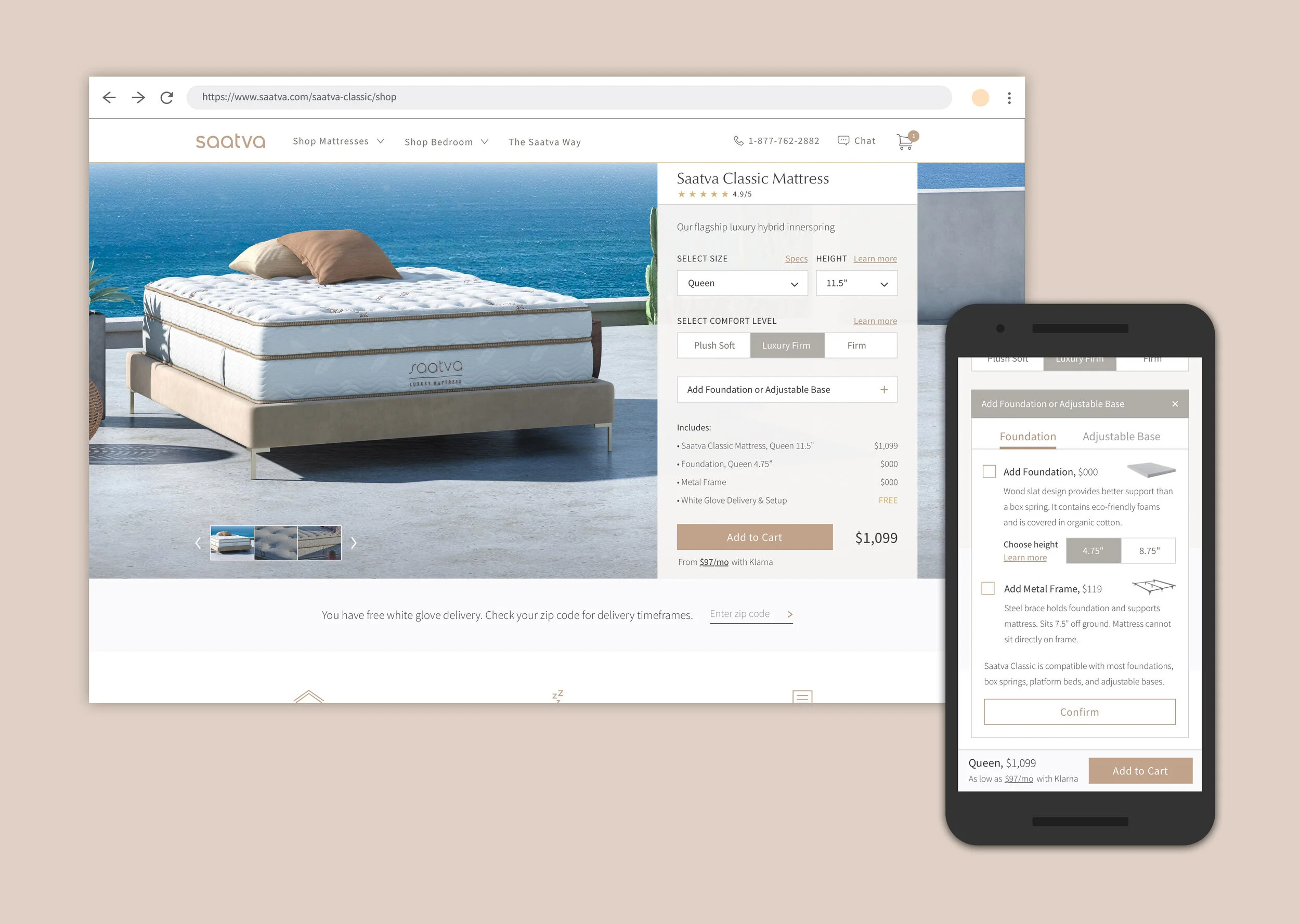
Mapping the new configuration
We began by taking the options for a mattress & base and creating a user flow with the minimum number of steps necessary to add to cart. Considering that you can’t use a foundation and adjustable base together, grouping those into a single decision (rather than having them as separate elements) seemed like an obvious move.
Knowing that many customers are specifically looking for a standard or adjustable bed, we wanted to validate if that is naturally a decision made before or after configuring the mattress. We decided to test our standard flow against one that puts that as a top-level choice. It also had the added benefit of streamlining the options available for each bed style.
User Flow 1 - Base as an add-on

User Flow 2 - Type of bed as a top-level decision

Design and Prototype
We began by roughly sketching some ideas to organize the configuration. The priority from the beginning was simplification and visual clarity, so we erred on the side of limiting the number of interactive elements and also making sure that the components we used could be repeated for future products.
The decisions in the panel were ordered so that the customer is confronting the least complicated first. Base options were housed within a drawer so that we had space to give context to what is often reported as a confusing step.
There was burden of education that the old shop page took upon itself. Much of the excessive information that cluttered the configuration was shifted to pages earlier in our customer funnel, repeated inside modals available on the panel, or moved lower on the shop page.

Drawer solution for User Flow 1

Tabbed solution for User Flow 2

Test Results
The comparative test recorded with 9 participants yielded split results in overall sentiment toward each option. A closer examination of how they interacted with the configuration panels, rather than what they said about them, revealed more commonality and provided us a way forward. Almost no one clicked on the modals for more information, and as a result had some difficulty in making confident decisions regarding their base. In order to address this, we decided to make space to expose the most critical educational information as well as adjust the appearance of the modal links to make it clear they are interactive.
Follow up and adjustments
Since there was still some lingering ambiguity over the validity of the tabbed approach, we brought our findings to the product managers. After some discussion we agreed that the confusion caused by the top-level decision for customers that did not prefer that tabbed approach overwhelmed the convenience it offered to those that had a better idea of what base they wanted. Though we did not want to abandon the clarity offered by the binary tab selection. Moving the tab structure into the drawer allowed us to preserve that clear decision as well open up some more space to include key information about the foundation and adjustable base.
Shipped Config Panel


Where we ended up
The configuration panel established multiple pieces for a React component library that were used to set up shop pages for a host of other products. This project as part of the larger saatva.com marketplace build contributed to a nearly 50% increase in conversion for the Saatva Classic Mattress.